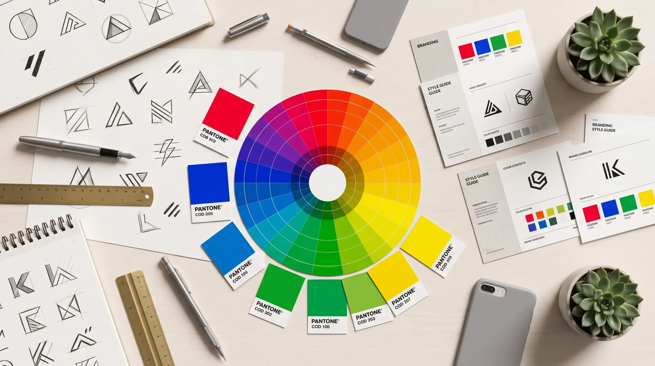
Colours play a huge role in how we perceive things – they can evoke emotions, create associations and even influence decision-making. The colour of a logo is one of the most important factors in determining how customers will perceive your brand. But how do you choose the right colour for your business logo? Let’s take a look at the psychology of colour and some specific examples from successful brands.
🟥Red – Energy, Passion, Urgency
The colour symbolises energy, enthusiasm and urgency, which is why it attracts attention and stimulates.
Suitable for: Fast-food, retail, sports and technology companies.
Examples: KFC, Puma, Bernina.
🟦Blue – Trustworthiness, Stability, Professionalism
This colour evokes a sense of calm and trust, and is often used in the finance and technology sectors.
Suitable for: Banks, IT companies, the healthcare sector.
Examples: Decathlon, Visa, Facebook.
🟩Green – Naturalness, Sustainability, Health
The colour is associated with the harmony of nature, ecology and health.
Suitable for: Organic food, health- and environmentally-friendly brands.
Examples: Subway, Reebok, Starbucks.
🟨Yellow – Optimism, Warmth, Creativity
Colour attracts attention and evokes positive emotions.
Suitable for: Children’s products, innovation and the creative industries.
Examples: McDonald’s, IKEA, Snapchat.
⬛Black – Luxury, Elegance, Strength
The colour symbolises strength, elegance and prestige, and is often found in luxury brands.
Suitable for: High-end fashion, automotive and technology companies.
Examples: Apple, Audi, Chanel.
⬜White and grey – Simplicity, Minimalism, Innovation
White and grey convey a sense of cleanliness and neutrality.
Suitable for: Technology, pharmaceutical and design companies.
Examples: Electrolux, Mercedes-Benz, Sony.
How do you choose the right logo colour for your business?
Have you ever noticed that when you walk into a restaurant with red walls, you immediately feel hungry? This is no coincidence – the colour red stimulates the appetite and boosts energy levels. In exactly the same way, the choice of colours in logo design can influence customers’ emotions and decisions. That’s why it’s important to consider which colours best reflect the essence and values of your business.
Research your target audience – which colours will appeal to your customer base? Consider the specifics of your industry – which colours do your competitors use? Test colour combinations – you don’t always have to choose a single colour; there may be successful combinations. Test the logo against different background options – how does it look in both digital and printed formats?
The choice of colours in logo design is not merely a matter of aesthetics; it directly influences how customers perceive your brand. The right choice of colour can help to forge an emotional connection with your audience, increase brand recognition and reinforce your company’s values.
Are you sure that the colour of your brand’s logo reflects what you want it to? If you’d like some professional advice, please get in touch with us!